Tuesday, October 25, 2011

Module 4 - Field Journal

Arts and Crafts Movement in the Information Age

Just like the Industrial Revolution changed the world in the 1800’s, the Information Age we live in today is shaping our world.  Also, like the Industrial Age, the information technology industry has been so focused on meeting the great demand for information, that the aesthetics of graphic design have been disregarded. And, similar to how the Arts and Crafts Movement worked to bring aesthetics back to book design, a recent movement, maybe motivated by more commercial interests, is occurring today in the Information Age. 

In the San Jose Mercury News, (October 23, 2011, Section E, page 1), an article entitled Online aesthetics, reports about the aesthetic design movement of today, (the full article is a very interesting and worthwhile read).  While the article focuses on Google, the overall message is that the information technology industry is maturing from one focused simply on presenting information, to one interested on presenting the information with more attention to graphic design.  Former design director for The New York Times website, Khoi Vinh is quoted in the article, “It’s really clear that consumers care about (design) now… In an earlier age when tech was still rough and immature, you could win on technology alone.  But now, tech is mature enough that people really value and look for the best possible design.  It’s why Apple sold 4 million iPhone 4Ss” its first weekend on sale.

The article later goes on to say that the demand from information technology companies for employees with interactive design experience is very high.  Liz Danzico, chairwoman of the New York School of Visual Arts MFA interactive design program is quoted in the article, “Interactive design students in programs like New York’s School of Visual Arts have become targets for Silicon Valley recruiters, with companies like Apple, Yelp, Twitter, Facebook and Google making job offers to recent graduates…companies are realizing that design can be a differentiator for users.”

A rise in the desire for aesthetics, according to the article, was also demonstrated by Facebook’s purchase of Daytum last Spring.  Daytum is a startup that collects personal statistics and shares them through striking digital graphics.  The article also reports that Facebook brought in a team of designers from the New York Daytum office to work on its new Timeline feature.

While maybe not motivated by the same ideals as the Arts and Crafts Movement of the Industrial Age, the Information Age is similar in that there is a movement to unify beauty with function.  Here’s to history repeating itself.

Original Google Page - 1997


Original Facebook Page - 1996


Tuesday, October 18, 2011

Module 3 - Field Journal


Seventeenth Century Graphic Design Innovation?

Many design innovations created in the incunabula and Renaissance periods are clearly represented in graphic design today, but what about the seventeenth century?  Megg's History of Graphic Design mentions that it was a relatively quiet time for graphic design innovation, but did any change occur?

According to the book, Typography and Graphic Design  written by, Roxane Jubert, a few graphic design changes did occur in the seventeenth century.  For instance, the typeset book title page changed in that the title became arranged systematically, (codified); the name of the author was isolated; the use of type styles and sizes were arranged hierarchically according to importance of the information; and divisions between lines and wording coincided.  These changes are seen in books today.


                 Miklos Kis, title page
 Second Half of the seventeenth century
             
In addition to book title page design changes, seventeenth century graphic design and typography expanded into other areas, typically into materials less bulky than books.  These included handbills and periodicals, (news sheets, canards, gazettes, broadsheets and other ephemera.)

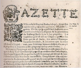
Gazettes, (named after the ‘gazzetta’ currency charged for the paper), appeared in mid-sixteenth century Venice.  The gazettes were printed in a broadside or booklet form.  These pieces contained news of current affairs, and were sold by street vendors. 
  Upper section of a page from La Gazette (French periodical)  September, 1633

In the early 1600’s, political and religious events were printed as intelligencers and journals in urban centers of western and northern European such as, Augsburg, Frankfurt, Antwerp, the Netherlands, France, and England.  According to Graphic Design History, A Critical Guide by, Johanna Drucker, the Avisa Relation oder Zeitung, published in Augsburg, Germany, in 1609, “is considered the first newspaper to establish conventions of the medium.  It presented an identifiable masthead, promised a regular appearance, and printed information of a timely nature.”

In Boston, on Thursday, September 25, 1690, the first newspaper, entitled Publick Occurrences was printed in the American colonies.  The first lines of the paper declared the purpose of the paper, “It is designed, that the Country shall be furnished once a month (or if any Glut of Occurrences happen, oftener) with an Account of such considerable things as have arrived unto our Notice”.  Included in the design of the paper was the use of italics for editorial comment and emphasis, as well as double column layout, and roman face for the text.
  Publick Occurrences Newspaper, 1690
                        
  
Other examples of the varied use of typography in the seventeenth century include the printing of ephemera, (transitory written and printed matter not intended to be retained or preserved). The sailing notice pictured below was used to communicate information with the public,

Sailing Notice, 1680

So, did the seventeenth century provide some graphic design innovation?  Yes.  The innovations may not have been as plentiful and impactful as innovations produced in the fifteenth and sixteenth centuries, but the seventeenth century did bring us present day title page design, newspaper design, and moved us from printing mostly books, to a variety of other printed material.


Tuesday, October 11, 2011

Module 2 - Field Journal

Does Culture Influence Alphabet Design and Function?

After reading Megg’s History of Graphic Design, chapters one through four, I decided to explore more thoroughly the influence of culture on alphabet character design, and whether these cultural influences effect how we use the alphabet.

Alphabet Design

I’m completely amazed by all we have learned about the development of writing and the alphabet; how we’ve gone from pictographs and ideographs to phonograms, and the alphabet we know today.  In Megg’s History of Graphic Design, the chart on page 18 helped me see how the original Phoenician alphabet characters were refined by successive cultures.


One example of cultural influence on design is the Classical Greek alphabet. Classical Greek philosophy influenced the graphic quality of the alphabet.  Classical Greek philosophy emphasized harmony in all aspect of human life:  

Humans (sic) formed the center of the universe as an independent human being…were able to contribute and take active part in the success of their life. To achieve this it was important to pursue (sic) harmony in their lives instead of chaos. 

Balance, harmony, was a very important concept during the Classic Period. Optimally harmony was believed to be a sign of divinity.” 

This philosophy carried over into Greek alphabet characters, as described by the textbook on page 23, “From a graphic design standpoint, the Greeks applied geometric structure and order to the uneven Phoenician characters, converting them into art forms of great harmony and beauty”.

The information led me to investigate the effect of contemporary high-tech culture on alphabet character structure. Given the quick, and ever-increasing availability of information today via the internet and smart phones, as well as text messaging, popularity of social websites, and development of a more international business climate, how has the alphabet changed?


To investigate the impact of high-tech, and international business culture on alphabet characters I searched the web for recent examples of typeface hoping to find new high-tech inspired typography designs.  I found new typography examples at www.typography.com, a site produced by design firm Hoefler & Frere-Jones.  However, what really intrigued me about the designs were the selling points.

While reviewing the site, three typeface caught my eye: Gotham Extra Narrow, Mercury Text and Display, and Gotham.  Of special interest to me were the website selling points which exemplified the impact of high tech and international business.  For instance, a selling point for the new Gothic Extra Narrow typeface describes it as “A new width of Gothic designed for space efficiency – think web graphics, publications…” and, the Mercury Text and Display type is described as “High performance meets high style in Mercury, a family of text and display faces specially designed to shine in different media.”   The Gotham typeface, is advertised as, “Open Type editions of Gotham contain H&FJ’s Latin X character set, covering more than 140 languages throughout the world…” Ok – well doesn’t this mean that not only can many countries use it, but also that companies with foreign business interests can use the typeface to consistently project their identity throughout the world; international graphic design cohesiveness?

Just for fun, I’ve included the following clip from the website.  The clip talks about “typefacial recognition” and how H&FJ is using it to develop type.  (I had trouble transferring the photograph to the journal, but those interested can view it at www.typography.com/ask/?path=head).


Typefacial Recognition at H&FJ Labs
We're generally content to control font outlines by pushing points around on a screen, but an intuitive interface for managing the entire gestalt of a type family remains elusive. H&FJ's Andy Clymer tends to develop fonts and tools together (one always seems to be the excuse to create the other), and this is his latest exploration: using facial recognition to control the basic parameters of a font's design.
Behold Andy modeling his latest creation, which employs Kyle McDonald's FaceOSC library, GlyphMath from RoboFab, and Tal Leming's Vanilla to mutate the geometries behind our Ideal Sans typeface in realtime. I'm intrigued by the potential to control local and global qualities of a typeface at the same time: fingers and mouse to design the details, faces and cameras to determine their position in a whole realm of design possibilities. I wonder about the possibilities of a facial feedback loop, in which one's expression of wonder and delight could instantly undo a momentof evanescent beauty. And then there are the possibilities of environmental pathogens affecting letterforms: what might too much caffeine, air conditioning, or ragweed pollen do to a typeface? Listening to Louis C.K.? Too many whiskey sours? —JH

Alphabet Function

In addition to exploring the impact of culture on alphabet design, I’m also interested in how culture influences alphabet use in visual communication.  In the textbook, the word ‘alphabet’ is clearly defined on page 18, “as a set of visual symbols or characters used to represent the elementary sounds of a spoken language.”  However, does culture alter how the alphabet is used to communicate?

For instance, during the Christian era, the culture of the period focused on the importance of religion and religious writings became sacred. As the textbook states on page 42,  “Sacred writings held great meaning for Christians, Jews and Muslims.  The use of visual embellishment to expand the word became very important, and illuminated manuscripts were produced with extraordinary care and design sensitivity.”


Illuminated Manuscript

Just as the Christian era influenced the use of alphabet characters for visual communication, today’s high-tech culture is also influential.  The speed with which we are expected to gather, interpret and distribute ever increasing amounts of visual information, seems to have transformed the original use of alphabet characters, to a combination of characters representing vocal sounds and ideas, (or ideographs).

There are articles criticizing technology, especially texting, for ruining our ability to write.  However true this may be, could it also be that today’s fast-paced, visual information loaded culture is trying to transform use of the alphabet to handle all this information?  And, is this new use going to become so identifiable that is gets transferred into graphic design?  I see this in my teenagers and friends text messages – the word ‘you’ is now ‘u’.  Is ‘u’ now a letter, or an ideograph?  Are what we consider acronyms, like ‘lol’, or ‘laugh out loud’, becoming such well know symbols that the combination of letters are an ideograph to communicate ‘funny’?


Text Messaging using Letters for Words

Also, while not alphabet characters, punctuation is used in as ideographs in our text message sentences, i.e. ‘:/’, or ‘argh’?  Following is an interesting text translation website,  http://www.noslang.com/, and some examples from the site,

bbf  -   best boy friend
bbfn  -   Bye Bye for now
bbfs  -   best boyfriends
bbfu  -   be back for you
bbi  -   Baby
bbiab  -   be back in a bit

Culture does impact both graphic quality and visual communication of alphabet characters.  I’m interested to see what the future brings.


----------------------------------


Sources:


www.the-artfile.com/ArtFile/history/classicperiod.shtml


www.typography.com


www.minicampress.com


http://www.noslang.com

telling-secrets.blogspot.com


Tuesday, October 4, 2011

Module 1 - Field Journal

Initial impressions


How did we get from there to here? And, we have a lot to learn.  These are my initial impressions after scanning the pages of Megg's History of Graphic Design.  How did we get from simple prehistoric cave paintings, made from earthy materials,


to multi-color digital designs?


My second impression, is that religious, economic, and political historical movements have influenced graphic design.  For instance, early in history, the importance of religion played a significant role in the elaborate graphic design of handmade biblical and illuminated manuscripts.  Later in history, technical advances developed during the industrial revolution seemed to inspire a greater variety of type, use of a  basic color palette, more commercial use of graphic design, and incorporation of various new art styles. An example of this can be seen in a poster designed by Leonetto Capiello in 1903, for E.A. Mele & Co.


Further into the book, it appears that political events have also effected graphic design, particularly when influencing popular thought.   Politically influenced graphic design has not only presented information, but has spoken, through design concepts, directly to the observer; to involve and inspire the reader to take action. The Uncle Sam Army recruiting poster exemplifies political influence on graphic design,


My last impression, after looking through Megg's History of Graphic Design, is one of awe.  I'm overwhelmed by the wealth of design work that came before us, and feel fortunate to learn from and build upon this legacy; harnessing the work of the past and incorporating that work to suit our communication needs today. The importance of the alphabet for instance, something I took for granted before reading this book, is abundantly more significant to me now.  And, I'm inspired to learn more and more about how did we get from there to here!