Seventeenth Century Graphic Design Innovation?
Many design innovations created in the incunabula and Renaissance periods are clearly represented in graphic design today, but what about the seventeenth century? Megg's History of Graphic Design mentions that it was a relatively quiet time for graphic design innovation, but did any change occur?
According to the book, Typography and Graphic Design written by, Roxane Jubert, a few graphic design changes did occur in the seventeenth century. For instance, the typeset book title page changed in that the title became arranged systematically, (codified); the name of the author was isolated; the use of type styles and sizes were arranged hierarchically according to importance of the information; and divisions between lines and wording coincided. These changes are seen in books today.

In addition to book title page design changes, seventeenth century graphic design and typography expanded into other areas, typically into materials less bulky than books. These included handbills and periodicals, (news sheets, canards, gazettes, broadsheets and other ephemera.)

Miklos Kis, title page
Second Half of the seventeenth century
Gazettes, (named after the ‘gazzetta’ currency charged for the paper), appeared in mid-sixteenth century Venice. The gazettes were printed in a broadside or booklet form. These pieces contained news of current affairs, and were sold by street vendors.
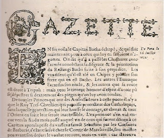

Upper section of a page from La Gazette (French periodical) September, 1633
In the early 1600’s, political and religious events were printed as intelligencers and journals in urban centers of western and northern European such as, Augsburg, Frankfurt, Antwerp, the Netherlands, France, and England. According to Graphic Design History, A Critical Guide by, Johanna Drucker, the Avisa Relation oder Zeitung, published in Augsburg, Germany, in 1609, “is considered the first newspaper to establish conventions of the medium. It presented an identifiable masthead, promised a regular appearance, and printed information of a timely nature.”
In Boston, on Thursday, September 25, 1690, the first newspaper, entitled Publick Occurrences was printed in the American colonies. The first lines of the paper declared the purpose of the paper, “It is designed, that the Country shall be furnished once a month (or if any Glut of Occurrences happen, oftener) with an Account of such considerable things as have arrived unto our Notice”. Included in the design of the paper was the use of italics for editorial comment and emphasis, as well as double column layout, and roman face for the text.

Other examples of the varied use of typography in the seventeenth century include the printing of ephemera, (transitory written and printed matter not intended to be retained or preserved). The sailing notice pictured below was used to communicate information with the public,

Publick Occurrences Newspaper, 1690
Other examples of the varied use of typography in the seventeenth century include the printing of ephemera, (transitory written and printed matter not intended to be retained or preserved). The sailing notice pictured below was used to communicate information with the public,

Sailing Notice, 1680
So, did the seventeenth century provide some graphic design innovation? Yes. The innovations may not have been as plentiful and impactful as innovations produced in the fifteenth and sixteenth centuries, but the seventeenth century did bring us present day title page design, newspaper design, and moved us from printing mostly books, to a variety of other printed material.
No comments:
Post a Comment